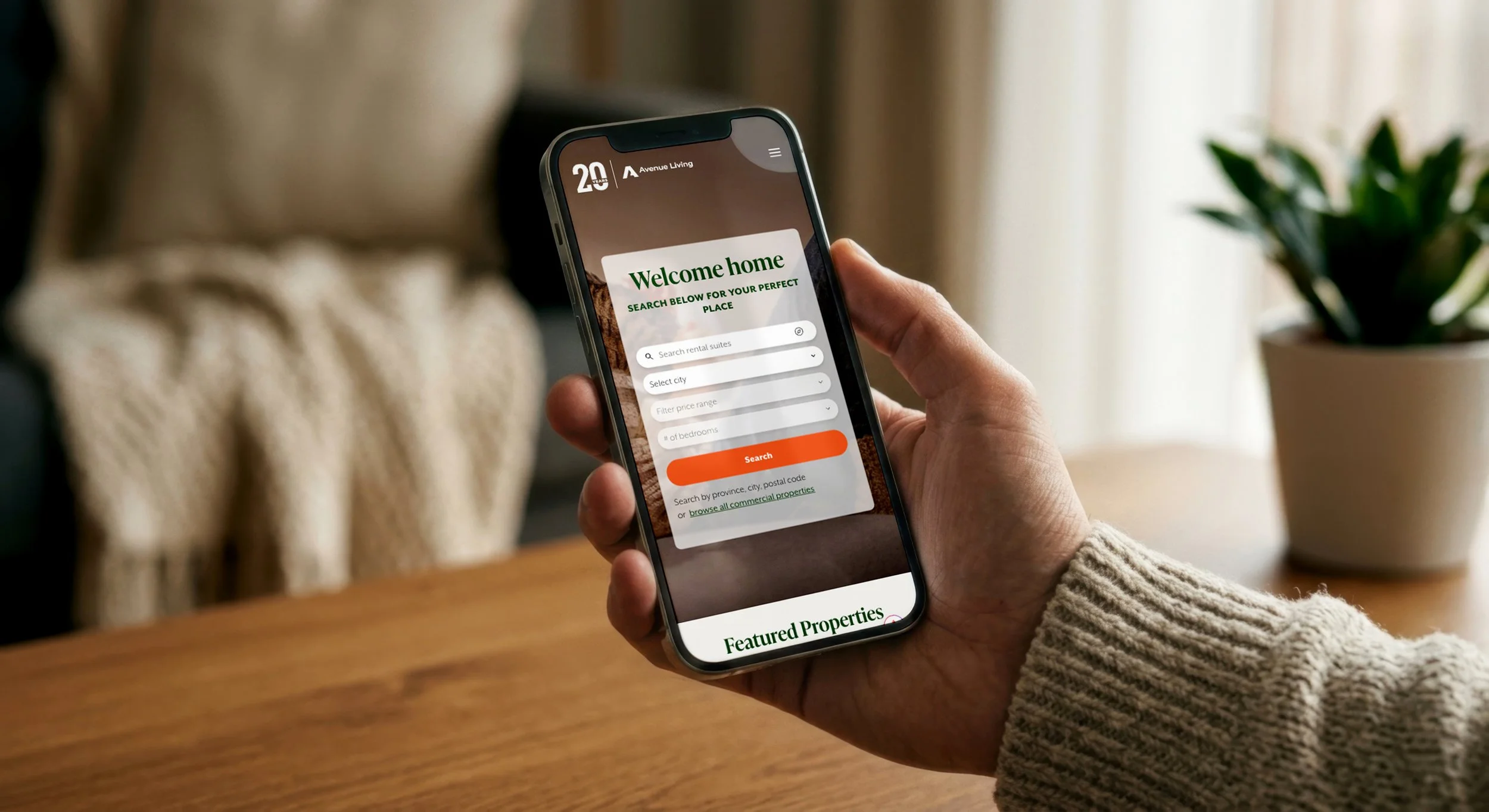
Avenue Living Residential (ALR) Website Redesign
Role
UX/UI Designer
Timeline
35 Weeks
Tools
Figma
Adobe Creative Cloud
UserTesting
Avenue Living's residential team requested a UX/UI overhaul of their public rental website, since the vast majority of prospective residents find their next home online, making the site the single biggest driver of new customer acquisition.
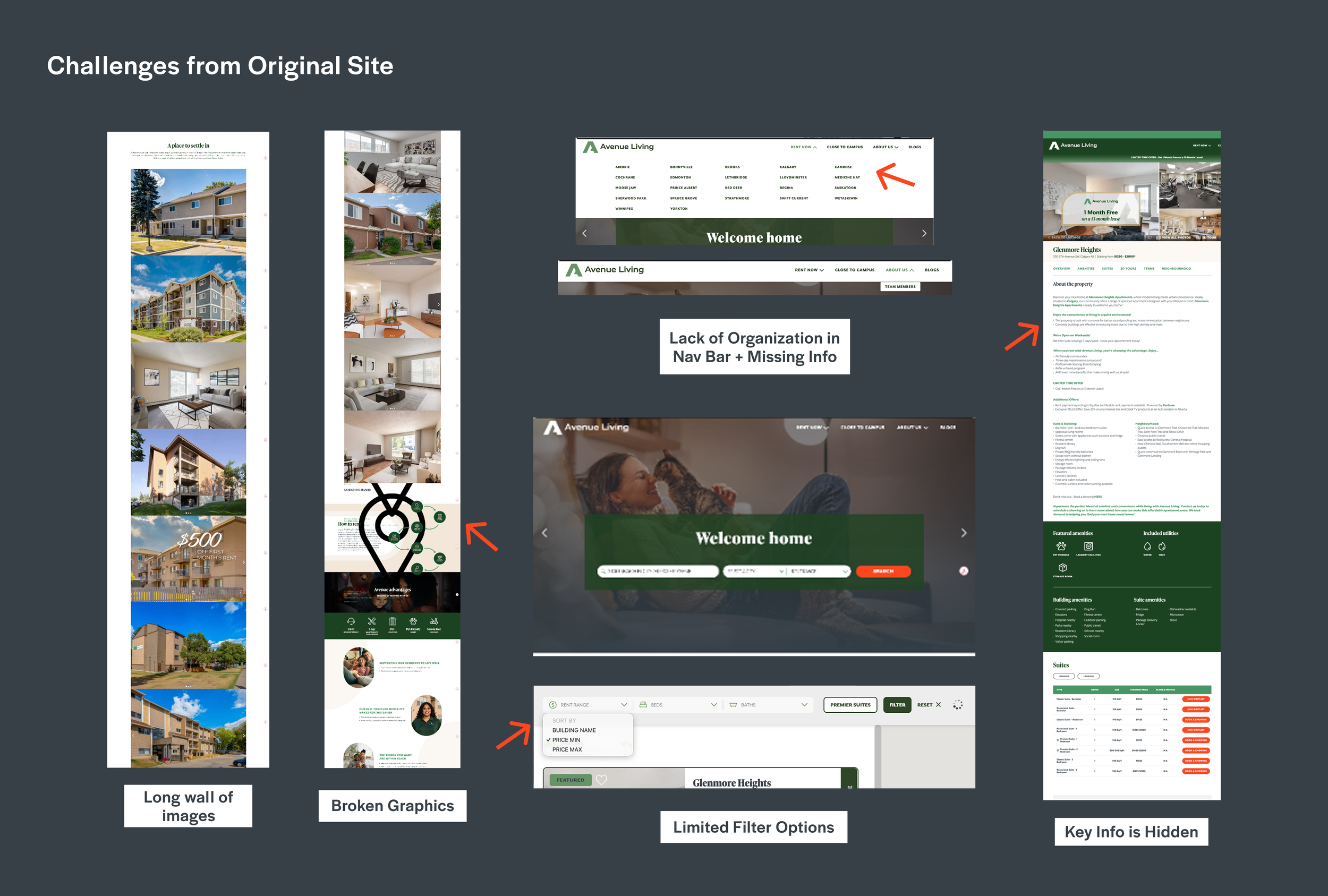
The existing site's information architecture was disorganized and difficult to search, key content was buried under long, text-heavy pages, and the mobile experience had several broken or unoptimized sections. With the company's property portfolio continuing to grow, the site also needed a structure that could scale alongside it rather than become more cluttered with every new building added.
As the UX/UI designer on this project, I led user research, competitor analysis, and the full redesign across desktop and mobile, working in sprints over 8 months and presenting to stakeholders at the end of each cycle to stay aligned through launch.
Overview
The previous site lacked any meaningful way to customize a search, and its filtering was too basic to reliably return relevant results. Combined with a disorganized navigation and long, dense pages, users had few tools to narrow down listings and often had to dig to find the information that actually mattered to them.
The site also had to work within a fixed technical foundation: it was built and hosted through a third-party developer, RentSync, chosen specifically for its integration with Yardi, the company's property management software. Existing brand guidelines for typography, color, and button styles were also fixed. My control was over information architecture, layout, and how content and imagery were used throughout, not the underlying visual system itself.
The Challenge
Goals
Give users the tools to find exactly what they're looking for, faster.
Replace basic, unreliable filtering with a detailed, customizable search experience so users can narrow listings by the details that actually matter to them, cutting down on aimless browsing and abandoned visits.
Simplify the Search
Reorganize the Content
Bring key information to the surface instead of burying it.
Restructure long, text-heavy pages and a cluttered navigation so the most important information, property stats, amenities, and calls to action, is immediately visible rather than requiring users to dig for it.
Design for Conversion
Turn browsing into booked tours.
Build multiple natural opportunities for users to convert throughout their journey, from a filterable hero section to related-property suggestions, so the site actively guides users toward taking action rather than passively displaying listings.
Build for Scale
A structure that grows with the portfolio, not against it.
Create an information architecture and design system flexible enough to accommodate an ever-growing number of properties and cities without becoming more cluttered or harder to navigate over time.
Research & Testing
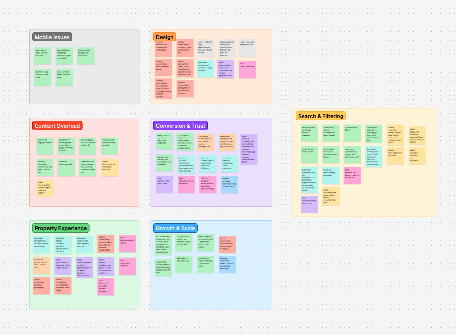
I conducted user interviews with residents actively searching for a rental, focusing on how they moved through the site, where they got stuck, and what information they needed before they'd feel ready to book a tour. Alongside this, I ran a competitor analysis across other rental companies in central Canada and the U.S., documenting layout patterns and standout features worth adapting. I consolidated both sets of research in FigJam to identify recurring themes, which shaped the priorities for the redesign: reorganized content, clearer calls to action, and significantly expanded search customization.
The clearest finding was that the site's lack of customization was likely costing conversions. Users had no way to filter by the details that actually mattered to their search, and I came to see that gap as the difference between someone passively browsing and someone converting into a booked tour.
Key Design Decisions
-
![]()
Expanded, Detailed Filtering
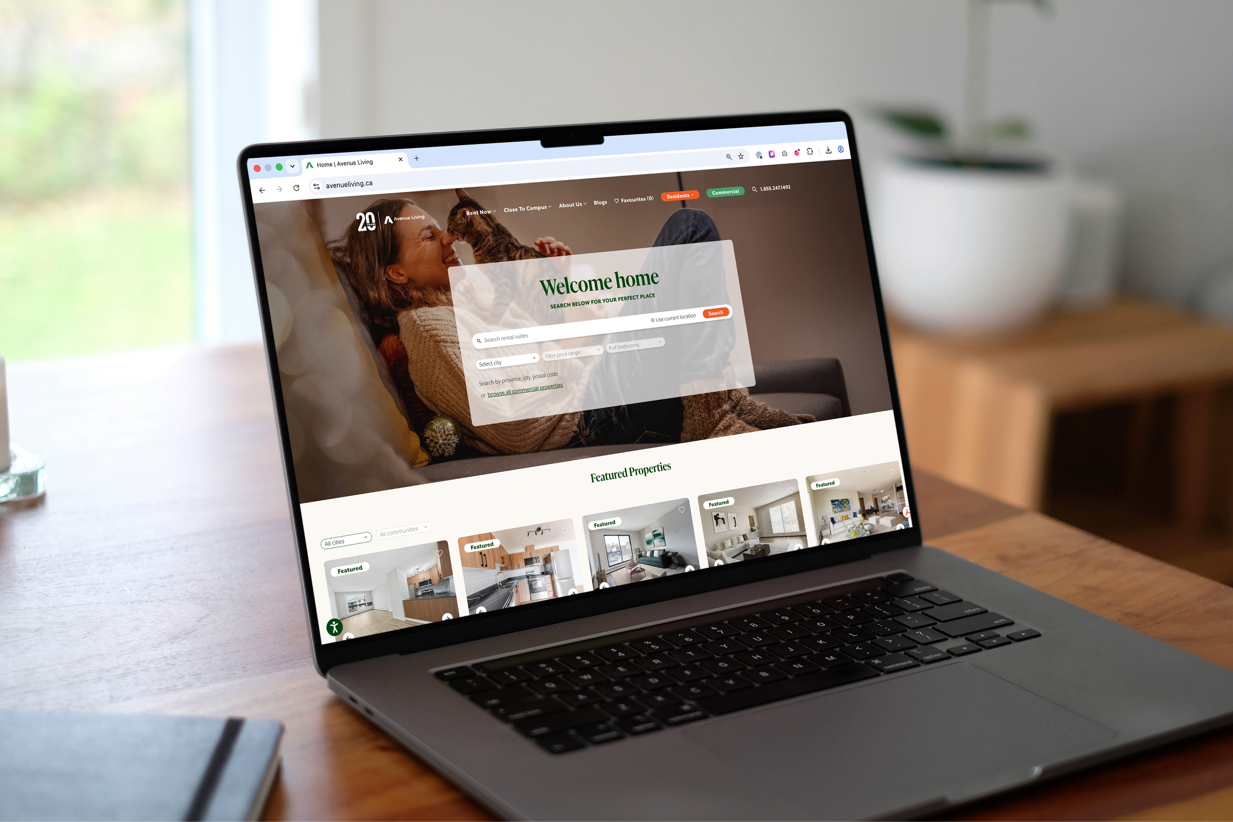
I built out a comprehensive filter system (adding in 20+ new filter options) so users could narrow results by exactly what mattered to them. Since research showed users typically already know what they want when they arrive; filter options were also added directly into the homepage hero. The goal was to spend their first few clicks moving them toward relevant listings, not making them hunt for a starting point.
-
![]()
Restructured Property Pages
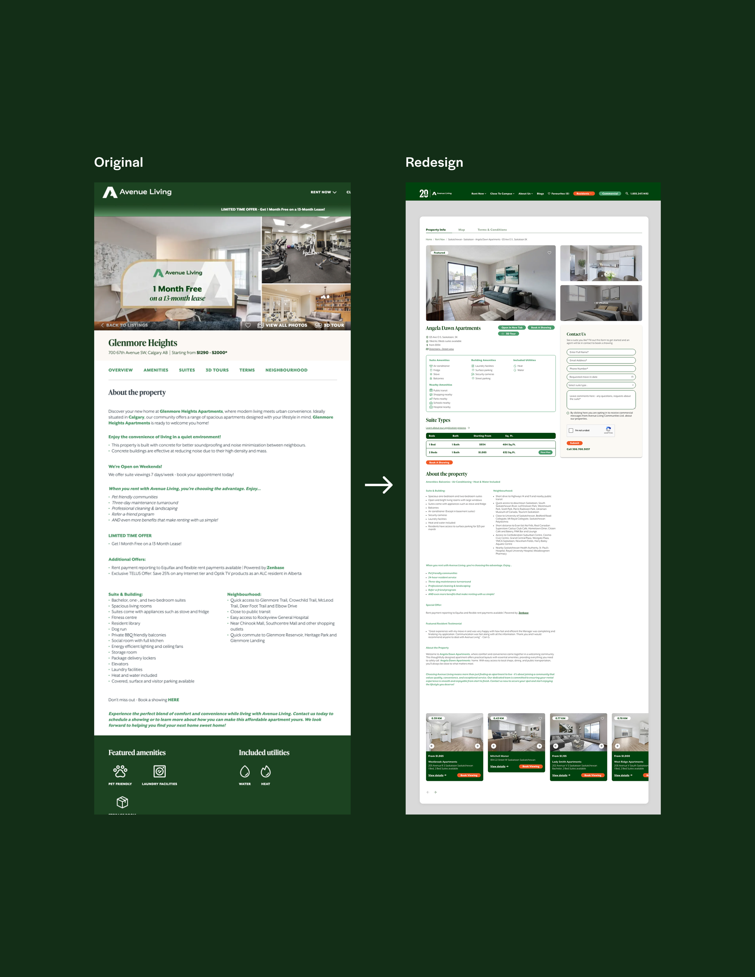
Research showed users gravitated toward key stats and amenities first, but the previous site buried that information at the bottom of the page under dense text. I moved it to the top and condensed the page overall, letting key information and imagery lead the experience.
-
![]()
Built-In Conversion Paths
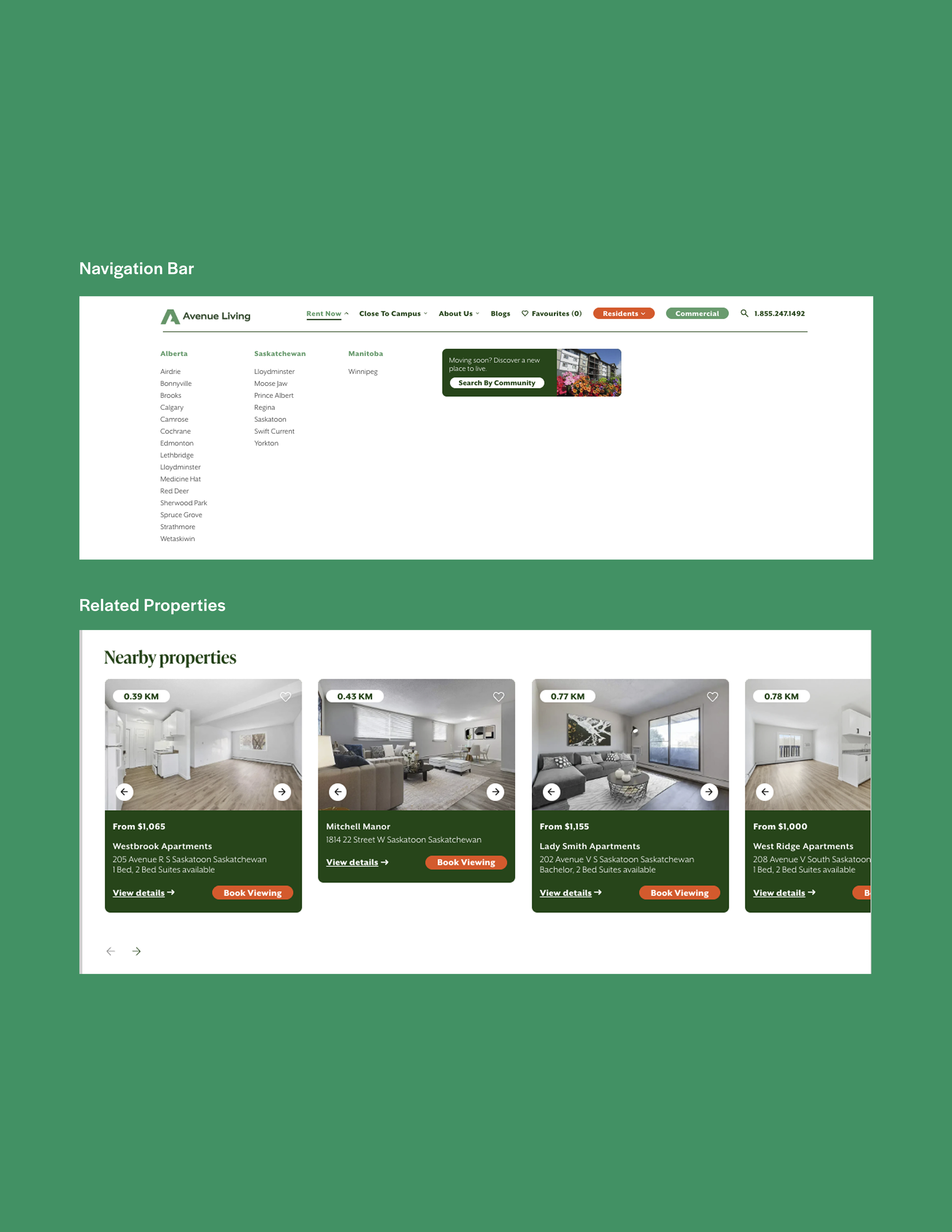
Every property page now surfaces similar nearby listings at the bottom, encouraging users to keep exploring within the company's portfolio. Navigation was also reorganized, consolidating a sprawling set of categories into clearer groupings, including a redesigned "Rent Now" section for scanning every city the company operates in, alongside a direct path to featured properties.
-
![]()
SEO-Friendly Content
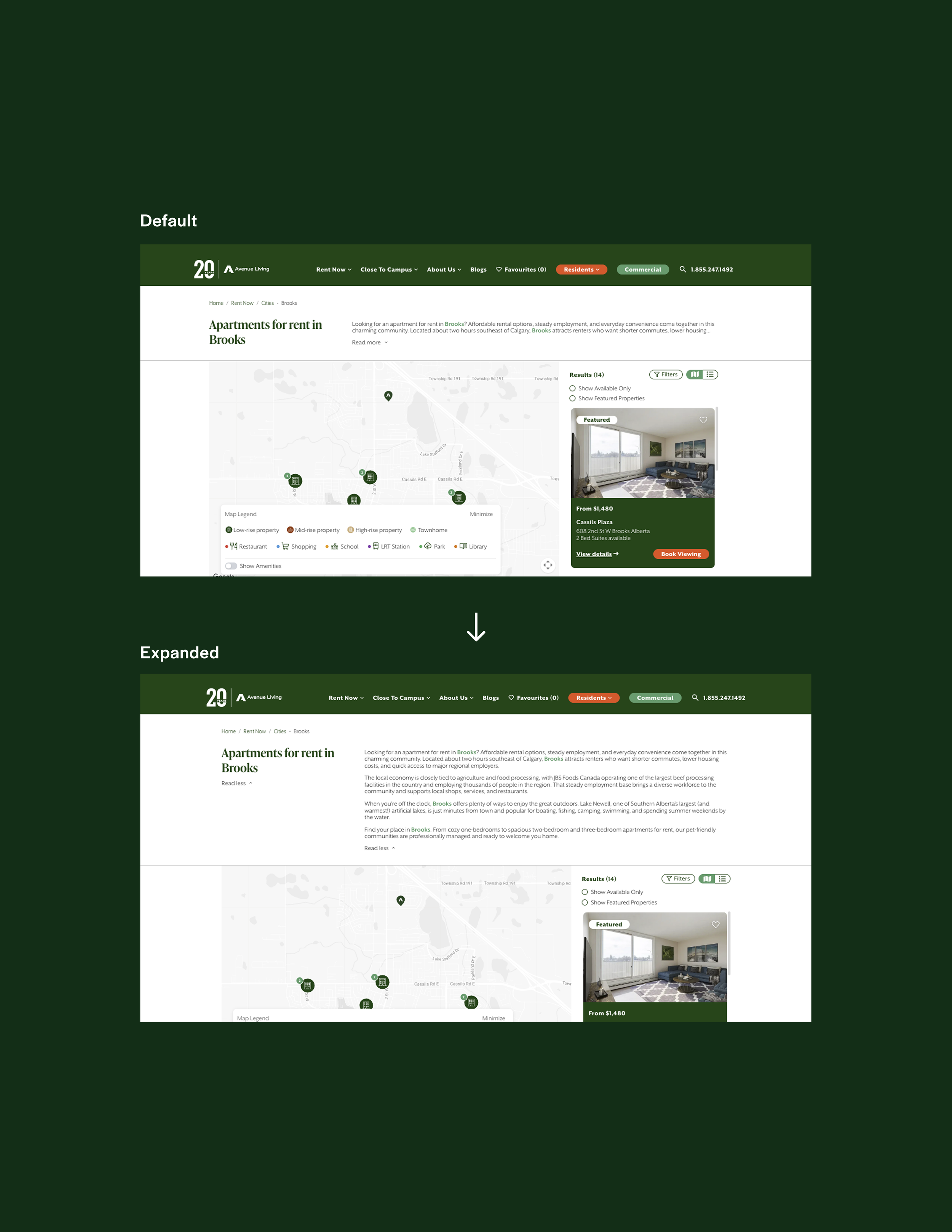
Working closely with the company's SEO specialist, I added expandable dropdown descriptions to the top of each city page to house additional keyword-rich copy required for SEO, without forcing users to land on a dense block of text the moment the page loaded.
-
![]()
Mobile Experience, Fixed & Optimized
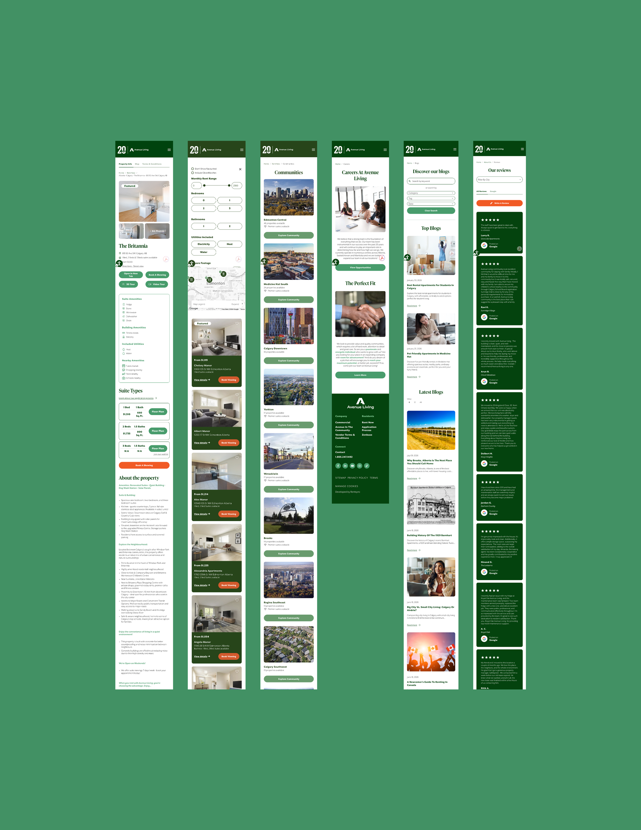
Several sections of the previous site were broken or unreliable on mobile. I went through and fixed and optimized these sections so the redesigned experience held up consistently across devices, particularly important given how many renters search for their next home on their phone.

Final Experience
Click on the image to experience the live site.
Outcome
Post-launch testing showed the new site was significantly easier to use, with users reporting that the expanded filtering helped them find relevant listings faster. A new favourites page let users organize saved listings while searching, a feature testing showed was especially well received. On-site property management and customer service teams reported a drop in user complaints and confusion, and leadership considered the redesign a success in improving conversion while upholding the quality of the brand.
Learnings
Working within an existing platform, brand system, and cross-team dependencies (SEO, third-party development, property management software) reinforced how much UX work happens inside real constraints rather than a blank canvas. Balancing user needs against business goals like SEO visibility and conversion paths, without letting either compromise usability, was the throughline of the entire project, and a good reminder that the best UX solutions are often the ones that quietly serve two priorities at once instead of picking one.